Widgets
Custom Table
2.4.0
Order widget
Custom Table
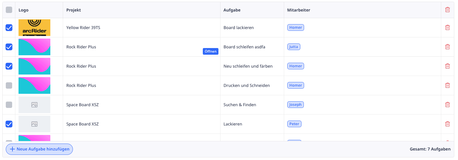
The Custom Table widget allows you to display dynamic, interactive tables directly on your Ninox interface – tailored to your needs. It is ideal for presenting structured data clearly, formatting it individually, and linking it with actions (e.g., for editing, deleting, opening records, or API calls).
Example:
Complete Application Code
The following is an exemplary application code that defines the basis of your Custom Table. Since the code can become extensive depending on the use case, we will guide you step-by-step from a simple base to more complex variants.
The structure is divided into two central areas:
data– defines the content and structure of your table (rows and columns)arcCustomTable()– is the global function that renders the widget. You provide thedatato it.
uniqueListId
The parameter uniqueListId is the unique identifier for your table. It ensures that your table is identified uniquely internally – especially when multiple tables are displayed simultaneously on a page.
Why is this important?
Style settings (e.g., colors, fonts, hover effects) are intentionally applied only to the table with the specified
uniqueListId.With multiple tables in one view, it may otherwise lead to conflicts with CSS classes or states.
✅ Best Practice:
Use meaningful, unique names – preferably in camelCase or with underscores.
tableId
With tableId, you specify the internal ID of the table in Ninox that the widget refers to. This ID is needed, for example, to:
Create new records using the “+” button in the footer (
create)Open or edit existing records (
popup,openFullscreen,update)Relate actions correctly to records of this table
height
With height, you determine the height of the table widget in pixels. This allows you to flexibly adapt the display to the layout of your page – no matter how much data is included.
💡 Values
The value is specified in pixels – e.g.,
"300px","500px", or"800px"."auto": The height automatically adjusts to the content. Perfect for dynamic content – but be mindful of possible layout jumps.In combination with
maxHeight, you can limit the automatic height.
minWidth
With minWidth, you set the minimum width of your table – regardless of how many columns or data are included. This ensures that the table is not displayed too narrowly, e.g., in narrow containers, tabs, or embedded views.
🔍 Format
The value is passed as text with a unit, e.g.,
"600px"Without specification, the table may collapse too narrowly with insufficient content – which can disrupt the layout.
💡 Note:
minWidth affects the outer table shell – not the column widths inside. For columns, there are separate options like width and minWidth directly in the columns block.
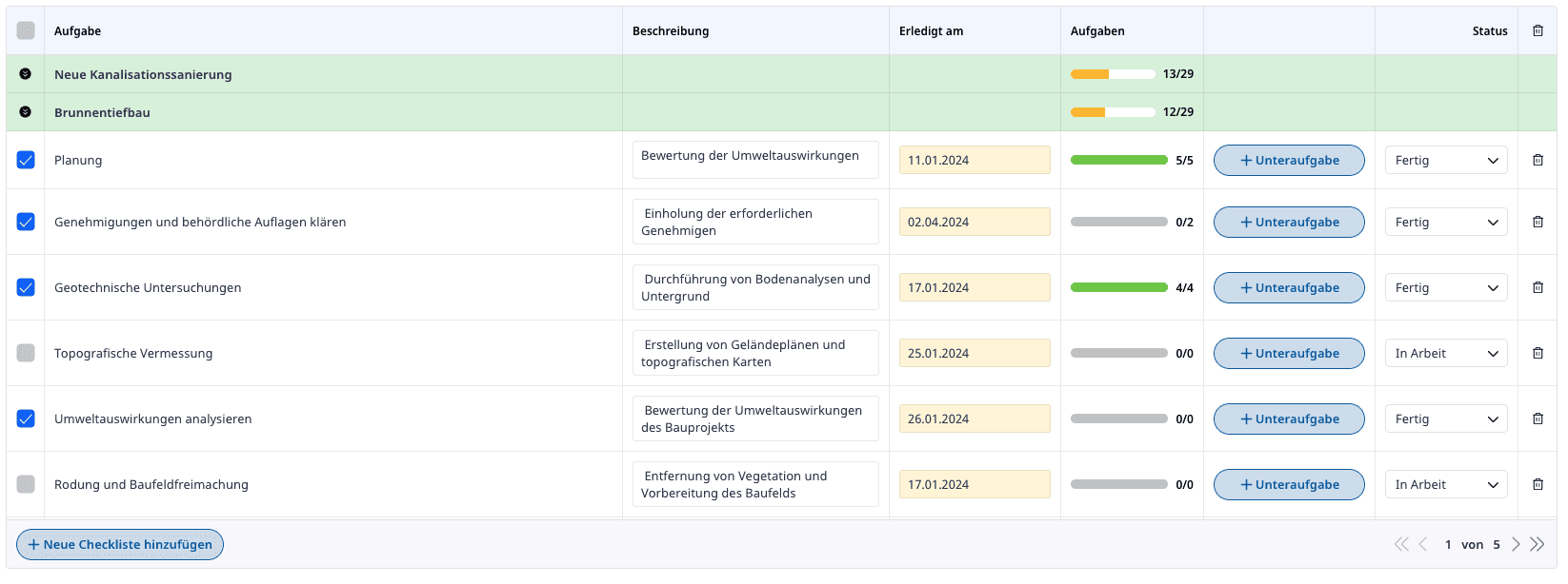
groupedBy
With groupedBy, you define which field (column key or field) your table should be grouped by. Groups are visually represented as separate rows with their own formatting – the underlying entries can be collapsed or expanded.
🔍 Behavior
You specify the column name (
field) that is defined in yourcolumnsblock.If the field is empty (
"") or missing altogether, no grouping takes place.Grouping can also be based on complex values (e.g.,
Type,Category,Responsible, etc.).The groups can be dynamically collapsed or expanded by clicking on the group row – this state is stored locally.
groupsCollapsed
With groupsCollapsed, you specify whether grouped rows should be displayed collapsed or expanded by default. The group header (groupRow) is always visible – only the associated entries (valueRows) are shown or hidden as needed.
This parameter only takes effect if groupedBy is set.
true = groups are collapsed on load (compact view).false = groups are fully opened on load.
The state (collapsed/expanded) is stored locally, meaning that upon reopening, the widget remembers the last state per user.
Default value: false (groups are open) – if not specified, the table shows all group entries completely.
embedded
With embedded, you activate the embedded mode of the table. In this mode, the table optimally adapts to existing layout structures – e.g., in a container, tab, or flexible UI area.
Default value: false – the table then takes its own, fixed place on the page.
If embedded: true is set, the widget is positioned relatively in the container rather than absolutely and takes its width and possibly other style specifications. Combined with parameters like height and minWidth, this ensures a clean, integrated appearance.
Especially useful is embedded in dashboards, tab views, or modal windows.
rowHoverAction
With the rowHoverAction block, you determine whether the hover behavior on table rows should be active – and if so, what colors should be used when hovered over with the mouse.
hoverActive: trueactivates the effect, otherwise, the row remains unchanged on hover.backgroundColordefines the background color of the row in the hover state,fontColorsets the text color during hovering.
Default value for hoverActive is true, if the block is set. Without rowHoverAction, the behavior is neutral – no hover effects.
Tip: Use subdued colors to keep the effect subtle and UX-friendly.
header
With the header block, you control the representation of your table header row (column headers). You can completely hide them, adjust their height, and customize colors and font sizes.
showHeader(true/false): Shows or hides the entire header row.height: Sets the height of the header row in pixels – e.g.,"48px"or"auto".fontColor: Defines the font color of the column headers.fontSize: Specifies the font size (e.g.,"14px").backgroundColor: Sets the background of the header row – e.g.,"white"or a hex value.
Default behavior:
If showHeader is not specified, the header row is shown. Without additional settings, default values for size, color, and background are used.
💡 Pro Tip:
If you set showHeader: false, the meaning of the data should still be clearly recognizable – e.g., through the position or color scheme of the columns. Otherwise, user orientation may suffer.
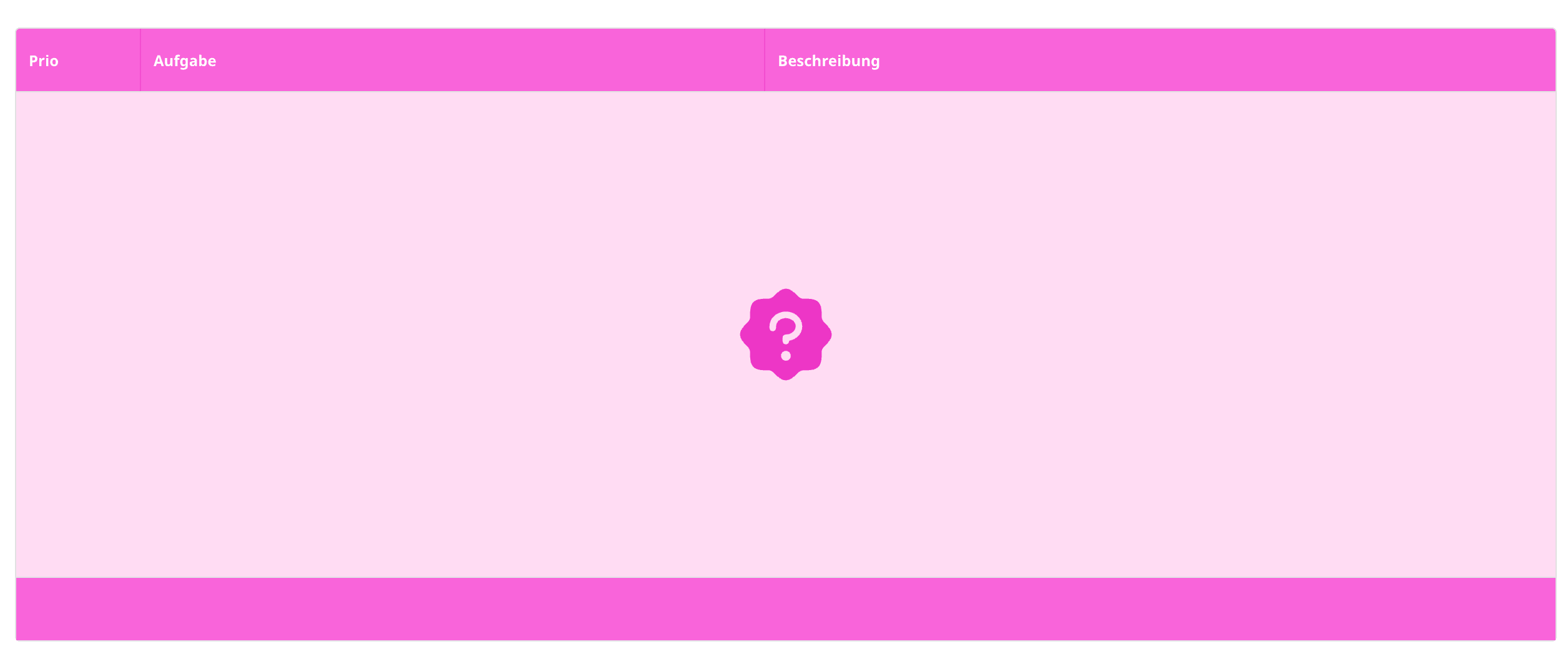
emptyTable
With the emptyTable block, you set what should be displayed when no data is present – i.e., when data: [] is empty. You can customize the text and design of the empty state to significantly improve user experience.
title: The main text displayed (usually prominently, e.g., "No entries found").value: Optional additional text or HTML elements inside the empty area.backgroundColor: Background color for the empty area – e.g.,"white"or"#f4f6ff".
Default behavior:
Without emptyTable, simple text "No results" is displayed.
💡 Pro Tip:
Empty states are not errors – they are your stage. Use them for explanations, motivating prompts, or a clear call to action ("Create a new entry now"). This way, your users won’t get stuck in emptiness – in the truest sense.
scrollBar
With the scrollBar block, you configure the horizontal scrollbar of your table. It appears when your table contains more columns than fit in the available area.
showScrollBar:trueorfalse– determines whether the scrollbar is shown at all.height: Height of the scrollbar container (e.g.,"10px").backgroundColor: Background color of the container.handle.height: Height of the slider (“handle”) within the bar.handle.backgroundColor: Color of the scroll handle.handle.borderRadius: Rounded corners of the slider (e.g.,"5px"or"50%").
Default behavior:
Without scrollBar, no visible scrollbar is shown – even if content overflows horizontally.
💡 Pro Tip:
Especially with many columns, a subtle, well-visible scrollbar helps to provide orientation. Use soft colors and a rounded handle shape to avoid the UI looking "technical" – especially on touch devices, this pays off.
theme
With the theme parameter, you can activate a predefined design template for your table. The theme affects the overall visual appearance – from colors to fonts to layout. Currently available are:
"clean-white"
"naked"
Important:
For the theme to apply correctly, the theme uniqueId must use the same uniqueListId as your table. Only then does the theme specifically overwrite the correct style rules via CSS.
Default behavior:
If no theme is set, the default design of the arcCustomTable widget is used (lightly shaded, high contrast).
footer
With the footer block, you can show a bottom area below the table – e.g., for buttons or information. It is ideal for action areas like "Create new entry" or for displaying sums, filters, or status info.
showFooter:trueorfalse– activates or deactivates the footer.showActionButton: Shows the default button "Create new record".actionButtonTitle: Custom text for the action button.backgroundColor: Background color of the footer.leftSideContent: Free content (e.g., text, HTML, icons) for the left side.rightSideContent: Content for the right side – e.g., status displays, sums, or info.
Default behavior:
Without a footer block, no footer is displayed. If showFooter: true is set but no further options, an empty footer area appears.
This is how the above-defined footer looks:
table
In the detail area table, you define all columns (columns) and their presentation, content, and behavior. Here you specify which data fields should be displayed, how they look, and what should happen when clicked.
Each column can be individually formatted (e.g., color, alignment, padding, actions).
The values set here override any global settings from the
settingsblock (e.g.,fontColor,backgroundColor,align, etc.).You can also control fixed columns, groupings, interactions, and inline editing here.
Row and Group Parameters
recordId:
Must be theNo.of the record (so the internal ID in Ninox).
Important for the assignment of actions, e.g., open, edit, delete.
rowColor:
Sets the background color of the respective row.
Accepts HEX values like"#f4f6ff"or"transparent".rowHeight:
Determines the height of the row.
Value can be"auto"or a fixed pixel specification like"60px".rowPaddingY
→ Vertical padding cushion (top/bottom) within the cells of this row.
Is applied to all cells as long as no individual padding is set there.groupRowColor:
Sets the background color for a group row (whengroupedByis active).
You can either use HEX values or dynamically access fields (e.g.,row.color).groupRowSettings.height
→ Sets the height of the group row.
Value e.g.,"40px"or"auto". Only takes effect if the row is a group row.
💡 Pro Tip:
You can use dynamically calculated colors to make status feedback directly visible – e.g., green for "all done", gray for "in progress":
columns
In the columns array, you define the individual columns of your table – how they look, what they are called, and what is displayed within them. Each column is described with its own object within columns.
Basics that you can set:
field: The data field to be displayed – must match the values indata.table.columns.title: The visible name of the column in the header.width: The width of the column (e.g.,"200px").align: Alignment of the content –"left","center", or"right".backgroundColor/color: Background and text color of the column.paddingX/paddingY: Inner margins horizontally and vertically.truncate: Whether the text should be truncated and suffixed with "…".fixed:"left"or"right", to fix a column.actions: Actions likeupdate,popup,change,openFullscreen,delete.
Groups Expand with groupExpandAction
With groupExpandAction, you can determine for which columns the expand function should be activated. This only works if you have set up a grouping in your table. If you activate it for at least one column (with groupExpandAction:true), it is automatically deactivated for the other columns unless you also activate it there in the parameters.
actions
With the actions parameter, you can specify what should happen when a user clicks on a cell or edits it. Actions are set at the cell level within columns (in data.table) and make your table interactive.
💡 Note: You can combine multiple actions by inserting them as an array.
Example:
Action: popup
With type: "popup", you define an action that opens the associated record as a popup when clicking on the cell – directly within Ninox. This allows users to view or edit details without leaving the current view.
recordIdmust be theNo.of the respective record.This action applies always to the entire cell, not just the text.
You can also display a button that explicitly triggers the popup with
showPopupButton: true– useful if you want to visually separate editing and opening.
Instead of making the entire cell clickable, you can also display a custom button within the cell – e.g., with the widget arcCustomButton.
To do this, you use:
showPopupButton: true– activates the button.popupButton– contains the rendered button element, for example viaarcCustomButton().
Action: delete
With type: "delete", you can delete the associated record by clicking on a cell. The action affects – as in popup – the entire cell.
recordIdmust point to theNo.of the record to be deleted.No additional confirmation dialog is built in – the deletion occurs directly.
💡 Note: This action should be used with caution and clearly visualized – e.g., by a special icon column or a red-marked button within the cell.
Action: update
With type: "update", you can directly change a field of the associated record when clicking on a cell – no popup, no edit mode.
recordId: TheNo.of the record to be changed.field: The field to be updated (as text).value: The new value to be set (text, number, bool, etc.).
💡 Pro Tip:
If you want to not delete directly, but rather perform it after a security query, you can take a small detour using a helper field + trigger:
Create a Yes/No field named e.g.,
trigger_delete.Add a
updateaction in the table that setstrigger_deletetotrue.In the trigger of this field, you use the following dialog:
Action: openFullscreen
With type: "openFullscreen", you open the associated record directly in fullscreen mode – as if it were called completely in Ninox.
recordId: TheNo.of the record to be opened.
Usage scenario:
If you have complex records with many tabs or sub-tables, openFullscreen is the better choice compared to popup.
Action: openRecord
With type: "openRecord", you open the form of the given record along with the corresponding table.
recordId: TheNo.of the record to be opened.
groupValue
With groupValue, you define the content of the group row in a specific column – i.e., what is displayed in the row that aggregates multiple records into a project, client, or status.
You can use
groupValuein any column – even multiple times per group if desired.You can embed simple text, HTML, or even mini-widgets (e.g., buttons, layouts, or status displays).
The group row is automatically displayed when
groupedByis set in thesettingsblock.
groupByValue
The groupByValue parameter allows you to group your table by another value than the displayed value. This allows you to control the display of the cell independently from the logic of grouping.
value: What the user sees in the cell (e.g., an icon, a label, an HTML element).groupByValue: The value by which the row is grouped.
Fallback:
If value or groupByValue is empty, the row is automatically assigned to the group arc-no-value.
This group is displayed normally but can also be specifically addressed or hidden.
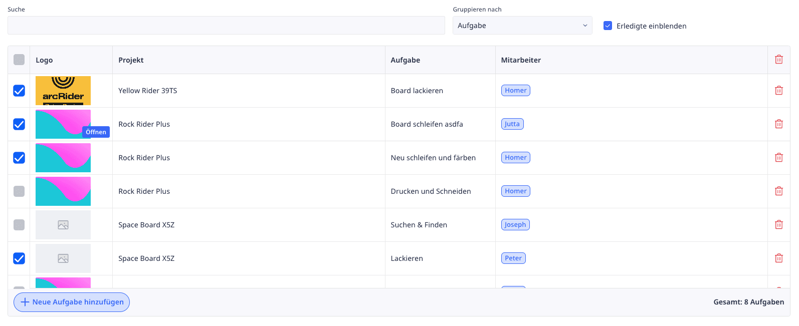
Examples
Below you will find some practical examples illustrating the different uses of the Custom Table.
Custom Table Simple
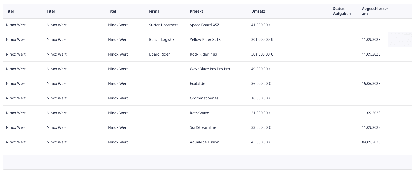
Custom Table Complex
Further Links: